Using PyCBC Distributions from PyCBC Inference
The aim of this page is to demonstrate some simple uses of the distributions available from the distributions.py module available at pycbc.distributions.
Generating samples in a Python script by using the .ini file
This example shows how to generate samples in a Python script by using a standalone .ini file,
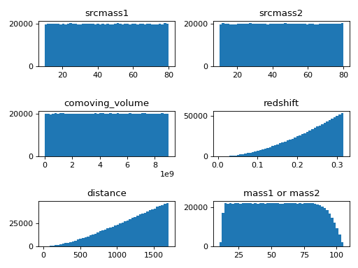
in this example, we can also learn that when we draw samples from source-frame masses and comoving volume uniformly, the distributions of detector-frame masses are not uniform.
import numpy as np
import matplotlib.pyplot as plt
from pycbc.distributions.utils import draw_samples_from_config


# A path to the .ini file.
CONFIG_PATH = "./pycbc_bbh_prior.ini"
random_seed = np.random.randint(low=0, high=2**32-1)

# Draw a single sample.
sample = draw_samples_from_config(
            path=CONFIG_PATH, num=1, seed=random_seed)

# Print all parameters.
print(sample.fieldnames)
print(sample)
# Print a certain parameter, for example 'mass1'.
print(sample[0]['mass1'])

# Draw 1000000 samples, and select all values of a certain parameter.
n_bins = 50
samples = draw_samples_from_config(
            path=CONFIG_PATH, num=1000000, seed=random_seed)

fig, axes = plt.subplots(nrows=3, ncols=2)
ax1, ax2, ax3, ax4, ax5, ax6 = axes.flat

ax1.hist(samples[:]['srcmass1'], bins=n_bins)
ax2.hist(samples[:]['srcmass2'], bins=n_bins)
ax3.hist(samples[:]['comoving_volume'], bins=n_bins)
ax4.hist(samples[:]['redshift'], bins=n_bins)
ax5.hist(samples[:]['distance'], bins=n_bins)
ax6.hist(samples[:]['mass1'], bins=n_bins)

ax1.set_title('srcmass1')
ax2.set_title('srcmass2')
ax3.set_title('comoving_volume')
ax4.set_title('redshift')
ax5.set_title('distance')
ax6.set_title('mass1 or mass2')

plt.tight_layout()
plt.show()
(Source code, png, hires.png, pdf)

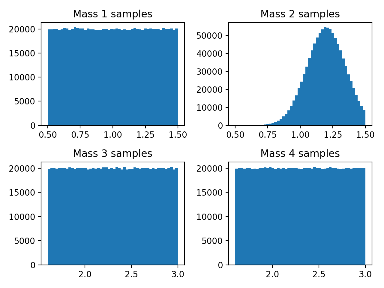
Making Mass Distributions in M1 and M2
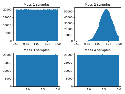
Here we will demonstrate how to make different mass populations of binaries. This example shows uniform and gaussian mass distributions.
import matplotlib.pyplot as plt
from pycbc import distributions

# Create a mass distribution object that is uniform between 0.5 and 1.5
# solar masses.
mass1_distribution = distributions.Uniform(mass1=(0.5, 1.5))
# Take 100000 random variable samples from this uniform mass distribution.
mass1_samples = mass1_distribution.rvs(size=1000000)

# Draw another distribution that is Gaussian between 0.5 and 1.5 solar masses
# with a mean of 1.2 solar masses and a standard deviation of 0.15 solar
# masses. Gaussian takes the variance as an input so square the standard
# deviation.
variance = 0.15*0.15
mass2_gaussian = distributions.Gaussian(mass2=(0.5, 1.5), mass2_mean=1.2,
                                        mass2_var=variance)

# Take 100000 random variable samples from this gaussian mass distribution.
mass2_samples = mass2_gaussian.rvs(size=1000000)

# We can make pairs of distributions together, instead of apart.
two_mass_distributions = distributions.Uniform(mass3=(1.6, 3.0),
                                               mass4=(1.6, 3.0))
two_mass_samples = two_mass_distributions.rvs(size=1000000)

# Choose 50 bins for the histogram subplots.
n_bins = 50

# Plot histograms of samples in subplots
fig, axes = plt.subplots(nrows=2, ncols=2)
ax0, ax1, ax2, ax3, = axes.flat

ax0.hist(mass1_samples['mass1'], bins = n_bins)
ax1.hist(mass2_samples['mass2'], bins = n_bins)
ax2.hist(two_mass_samples['mass3'], bins = n_bins)
ax3.hist(two_mass_samples['mass4'], bins = n_bins)

ax0.set_title('Mass 1 samples')
ax1.set_title('Mass 2 samples')
ax2.set_title('Mass 3 samples')
ax3.set_title('Mass 4 samples')

plt.tight_layout()
plt.show()
(Source code, png, hires.png, pdf)

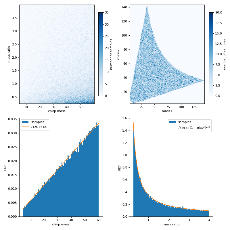
Generating mchirp and q from uniform mass1 and mass2
This example shows chirp mass and mass ratio samples drawn from uniform mass1 and mass2 with boundaries given by chirp mass and mass ratio. The first row of the figures below are the chirp mass and mass ratio samples, and the same set of samples converted to mass1 and mass2, respectively. The second row are the marginalized distribution for chirp mass and mass ratio, with comparisons for analytical probability density function (PDF).
import matplotlib.pyplot as plt
from pycbc import distributions
from pycbc import conversions
import numpy as np

# Create chirp mass and mass ratio distribution object that is uniform
# in mass1 and mass2
minmc = 5
maxmc = 60
mc_distribution = distributions.MchirpfromUniformMass1Mass2(mc=(minmc,maxmc))
# generate q in a symmetric range [min, 1/min] to make mass1 and mass2
# symmetric
minq = 1/4
maxq = 1/minq
q_distribution = distributions.QfromUniformMass1Mass2(q=(minq,maxq))

# Take 100000 random variable samples from this chirp mass and mass ratio
# distribution.
n_size = 100000
mc_samples = mc_distribution.rvs(size=n_size)
q_samples = q_distribution.rvs(size=n_size)

# Convert chirp mass and mass ratio to mass1 and mass2
m1 = conversions.mass1_from_mchirp_q(mc_samples['mc'],q_samples['q'])
m2 = conversions.mass2_from_mchirp_q(mc_samples['mc'],q_samples['q'])

# Check the 1D marginalization of mchirp and q is consistent with the
# expected analytical formula
n_bins = 200
xq = np.linspace(minq,maxq,100)
yq = ((1+xq)/(xq**3))**(2/5)
xmc = np.linspace(minmc,maxmc,100)
ymc = xmc

plt.figure(figsize=(10,10))
# Plot histograms of samples in subplots
plt.subplot(221)
plt.hist2d(mc_samples['mc'], q_samples['q'], bins=n_bins, cmap='Blues')
plt.xlabel('chirp mass')
plt.ylabel('mass ratio')
plt.colorbar(fraction=.05, pad=0.05,label='number of samples')

plt.subplot(222)
plt.hist2d(m1, m2, bins=n_bins, cmap='Blues')
plt.xlabel('mass1')
plt.ylabel('mass2')
plt.colorbar(fraction=.05, pad=0.05,label='number of samples')

plt.subplot(223)
plt.hist(mc_samples['mc'],density=True,bins=100,label='samples')
plt.plot(xmc,ymc*mc_distribution.norm,label='$P(M_c)\propto M_c$')
plt.xlabel('chirp mass')
plt.ylabel('PDF')
plt.legend()

plt.subplot(224)
plt.hist(q_samples['q'],density=True,bins=n_bins,label='samples')
plt.plot(xq,yq*q_distribution.norm,label='$P(q)\propto((1+q)/q^3)^{2/5}$')
plt.xlabel('mass ratio')
plt.ylabel('PDF')
plt.legend()

plt.tight_layout()
plt.show()
(Source code, png, hires.png, pdf)
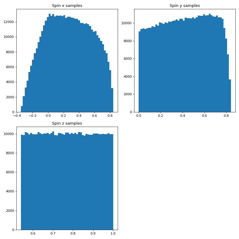
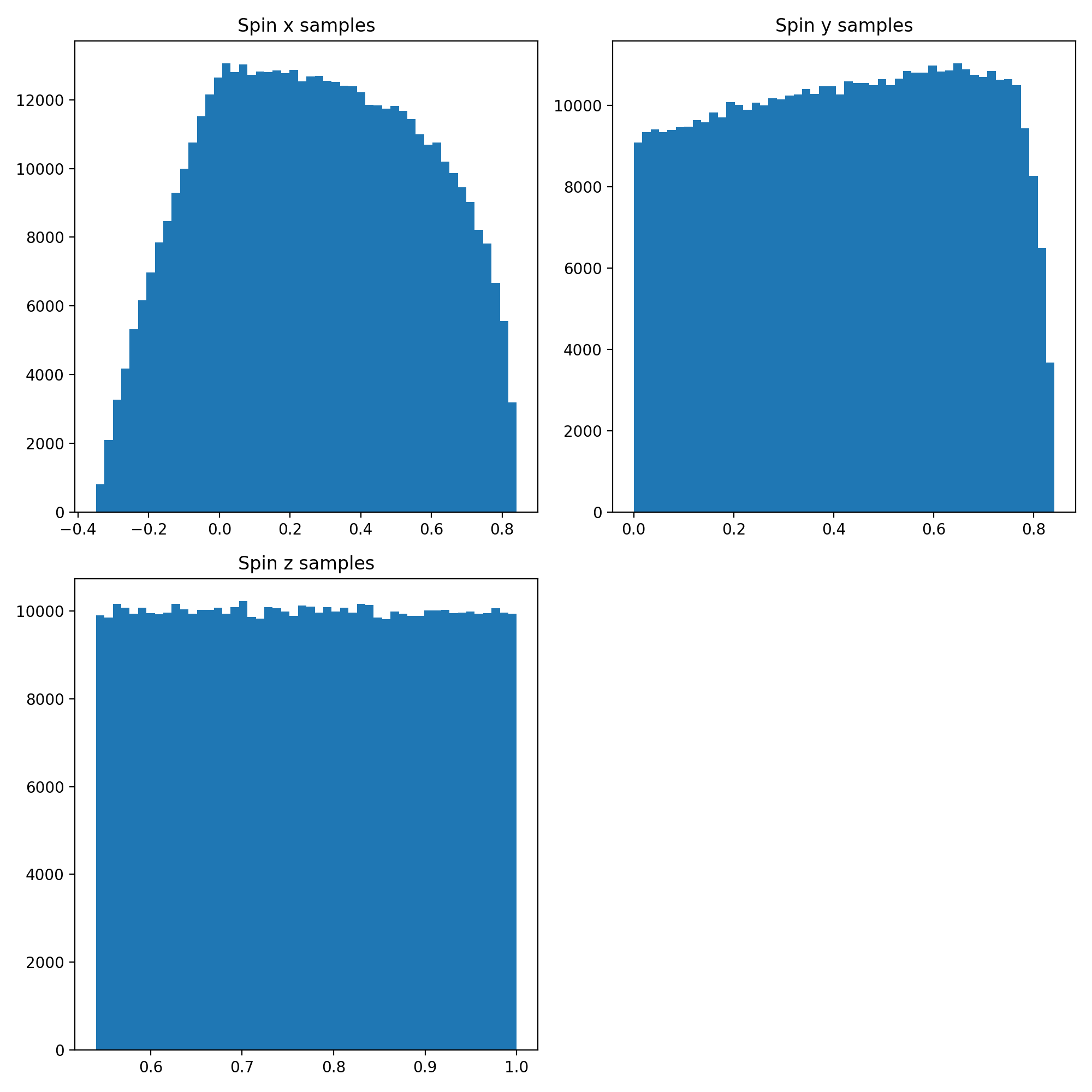
Sky Location Distribution as Spin Distribution Example
Here we can make a distribution of spins of unit length with equal distribution in x, y, and z to sample the surface of a unit sphere.
import matplotlib.pyplot as plt
import numpy
import pycbc.coordinates as co
from pycbc import distributions

# We can choose any bounds between 0 and pi for this distribution but in
# units of pi so we use between 0 and 1
theta_low = 0.
theta_high = 1.

# Units of pi for the bounds of the azimuthal angle which goes from 0 to 2 pi
phi_low = 0.
phi_high = 2.

# Create a distribution object from distributions.py. Here we are using the
# Uniform Solid Angle function which takes
# theta = polar_bounds(theta_lower_bound to a theta_upper_bound), and then
# phi = azimuthal_ bound(phi_lower_bound to a phi_upper_bound).
uniform_solid_angle_distribution = distributions.UniformSolidAngle(
                                          polar_bounds=(theta_low,theta_high),
                                          azimuthal_bounds=(phi_low,phi_high))

# Now we can take a random variable sample from that distribution. In this
# case we want 50000 samples.
solid_angle_samples = uniform_solid_angle_distribution.rvs(size=500000)

# Make spins with unit length for coordinate transformation below.
spin_mag = numpy.ndarray(shape=(500000), dtype=float)

for i in range(0,500000):
    spin_mag[i] = 1.

# Use the pycbc.coordinates as co spherical_to_cartesian function to convert
# from spherical polar coordinates to cartesian coordinates
spinx, spiny, spinz = co.spherical_to_cartesian(spin_mag,
                                                solid_angle_samples['phi'],
                                                solid_angle_samples['theta'])

# Choose 50 bins for the histograms.
n_bins = 50

plt.figure(figsize=(10,10))
plt.subplot(2, 2, 1)
plt.hist(spinx, bins = n_bins)
plt.title('Spin x samples')

plt.subplot(2, 2, 2)
plt.hist(spiny, bins = n_bins)
plt.title('Spin y samples')

plt.subplot(2, 2, 3)
plt.hist(spinz, bins = n_bins)
plt.title('Spin z samples')

plt.tight_layout()
plt.show()
(Source code, png, hires.png, pdf)
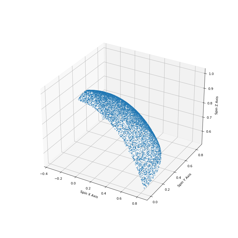
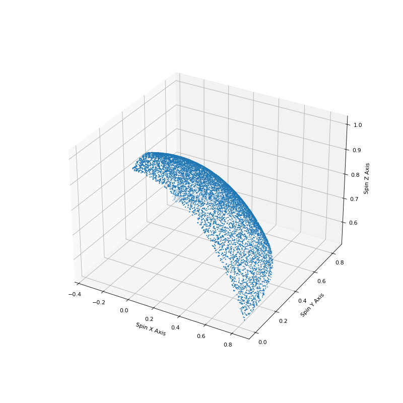
Using much of the same code we can also show how this sampling accurately covers the surface of a unit sphere.
import numpy
import matplotlib.pyplot as plt
import pycbc.coordinates as co
from pycbc import distributions

# We can choose any bounds between 0 and pi for this distribution but in units
# of pi so we use between 0 and 1.
theta_low = 0.
theta_high = 1.

# Units of pi for the bounds of the azimuthal angle which goes from 0 to 2 pi.
phi_low = 0.
phi_high = 2.

# Create a distribution object from distributions.py
# Here we are using the Uniform Solid Angle function which takes
# theta = polar_bounds(theta_lower_bound to a theta_upper_bound), and then
# phi = azimuthal_bound(phi_lower_bound to a phi_upper_bound).
uniform_solid_angle_distribution = distributions.UniformSolidAngle(
                                          polar_bounds=(theta_low,theta_high),
                                          azimuthal_bounds=(phi_low,phi_high))

# Now we can take a random variable sample from that distribution.
# In this case we want 50000 samples.
solid_angle_samples = uniform_solid_angle_distribution.rvs(size=10000)

# Make a spin 1 magnitude since solid angle is only 2 dimensions and we need a
# 3rd dimension for a 3D plot that we make later on.
spin_mag = numpy.ndarray(shape=(10000), dtype=float)

for i in range(0,10000):
    spin_mag[i] = 1.

# Use pycbc.coordinates as co. Use  spherical_to_cartesian function to
# convert from spherical polar coordinates to cartesian coordinates.
spinx, spiny, spinz = co.spherical_to_cartesian(spin_mag,
                                                solid_angle_samples['phi'],
                                                solid_angle_samples['theta'])

# Plot the spherical distribution of spins to make sure that we
# distributed across  the surface of a sphere.

fig = plt.figure(figsize=(10,10))
ax = fig.add_subplot(111, projection='3d')
ax.scatter(spinx, spiny, spinz, s=1)

ax.set_xlabel('Spin X Axis')
ax.set_ylabel('Spin Y Axis')
ax.set_zlabel('Spin Z Axis')
plt.show()
(Source code, png, hires.png, pdf)